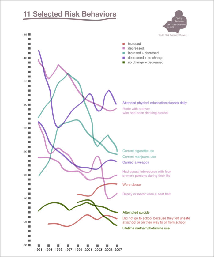
I chose 11 data under 45% and each color of those lines describes different data change patterns.
To harmonize various colors, I picked near opposite colors — greenish and reddish colors
and analogy colors— pink, purple, and reddish purple.
With harmonized colors, I pursue dynamic rhythms provided by fluently curved lines.
With fluent lines, I could achieve creativity of expression.
To create clarity, texts are left aligned except for texts in the ‘student’ icon on the top-right corner
which in the same place in each visualization maintain consistency.